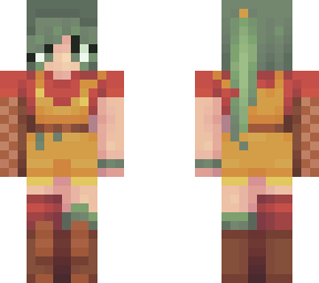
quick tip thing

Posted on: Jul 20, 2026
About 1 day ago
438
40
0
hiihihi

okay so basically, i just wanted to say this as it's something i had to figure out myself
(also im sure anyone with basic color theory knowledge already knows this, so just take this knowing ive never learned color theory formally.)

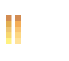
whenever i'm shading yellow/some oranges, and get to the highlights, it usually ends up looking dull, uninteresting, or sort of bleached or something. this common scenario is represented on the right.

but on the left, is what i actually like. the orange color becomes a bright yellow, that doesnt look bleached. it looks like it keeps getting brighter. this is because of the hueshifting i did. as i got closer to white on the color square, i more and more drastically moved the hue to be //yellowwwwww//.

i dont really know how to explain this and DISCLAIMER it doesnt apply to everything because depending on the skin you could be going for either of these.

but tldr, if you want a brighter color, hueshift more >-<

say somethign in the comments if you actually know what you're talking about and want to correct/add something to what i said here sob
Show More
Show Less

advertisement

Upload Download

Embed codes


Similar skins

Comments: 27

If dark blue is the main color I might give up

And I think you misunderstood my point about black in hueshifting, if you check my 3rd newest skin you'd see how I handle black
LOL

ahh i see okay
i think this gets the main idea, but is also based a lot on situation. you say you always get darker toward blue and light toward yellow? well, what if im starting with blue as a base, and i want the lighting to be pink/purple? then i could get darker toward cyan and lighter toward purple (which, sure, purple is in the direction of yellow, but it doesnt ever become yellow. and the shadow has to move away from the dark blue because the dark blue is the main color)
then theres the black starting with no saturation... i would disagree, since that makes for more of a dark gray the way i see it, and either way i would probably not make gray completely desaturated. i think saturation is one of those things that you really just have to decide for yourself how you want to use it.
If dark blue is the main color I might give up

And I think you misunderstood my point about black in hueshifting, if you check my 3rd newest skin you'd see how I handle black
The knowledge of hue shifting is a massive game changer, it's like the difference between a 2000 and a 2500 elo in chess, you're on another level and people (might) overlook your flaws in designs and other things altogether
yeah hueshifting is so nice, colors mean a ton in things like this
ive studied color theory a lot in the past and i totally agree, but it heavily depends on your artistic style. objectively, using hueshifts can help your art look more realistic, but especially with skins, people often use hue shifts just to stylize the lighting to give it a vibrant, colorful look. but also many people (including myself) intentionally don’t hueshift, as i prefer very neutral shading. many pastel skins also just look best without hueshifting. i do have exceptions though, like most shadows in the skin tones i hueshift to pink, but almost all the clothes and hair i shade dont use this technique. even though i would probably use the one on the right, the left would suit some other people much better. for the rant lol, im just excited that youre excited about this topic

you've studied color theory, what do you think of grimm's explanation?
Basically hue shifting from my POV:
1. Dark blue is the darkest, yellow is the brightest
2. Turn down brightness by a bit and move the color wheel in the closest path to dark blue from your current color to shade darker
3. Turn up brightness by a bit and move the color wheel in the closest path to yellow from your current color to shade brighter
4. Any changes to saturation is optional, I usually keep all my pixels at full saturation unless the main color is either black or white
5. Black starts from zero saturation to a little bit more saturation each time, hue shifts from dark blue to cyan (mostly but any color can do) and the brightness also moves twice or three times the distance of saturation, all until white
i think this gets the main idea, but is also based a lot on situation. you say you always get darker toward blue and light toward yellow? well, what if im starting with blue as a base, and i want the lighting to be pink/purple? then i could get darker toward cyan and lighter toward purple (which, sure, purple is in the direction of yellow, but it doesnt ever become yellow. and the shadow has to move away from the dark blue because the dark blue is the main color)
then theres the black starting with no saturation... i would disagree, since that makes for more of a dark gray the way i see it, and either way i would probably not make gray completely desaturated. i think saturation is one of those things that you really just have to decide for yourself how you want to use it.
The knowledge of hue shifting is a massive game changer, it's like the difference between a 2000 and a 2500 elo in chess, you're on another level and people (might) overlook your flaws in designs and other things altogether
Basically hue shifting from my POV:
1. Dark blue is the darkest, yellow is the brightest
2. Turn down brightness by a bit and move the color wheel in the closest path to dark blue from your current color to shade darker
3. Turn up brightness by a bit and move the color wheel in the closest path to yellow from your current color to shade brighter
4. Any changes to saturation is optional, I usually keep all my pixels at full saturation unless the main color is either black or white
5. Black starts from zero saturation to a little bit more saturation each time, hue shifts from dark blue to cyan (mostly but any color can do) and the brightness also moves twice or three times the distance of saturation, all until white
You're talking about color relativity specifically getting the color yellow from a limited palette and as for the hueshifting it really depends on the tone of yellow used or even hues that are close to
uh idk, i wasn't really talking about a limited palette
but yeah i agree you'd need to change this up a little depending on the specific skin/part of that skin you're working on
ive studied color theory a lot in the past and i totally agree, but it heavily depends on your artistic style. objectively, using hueshifts can help your art look more realistic, but especially with skins, people often use hue shifts just to stylize the lighting to give it a vibrant, colorful look. but also many people (including myself) intentionally don’t hueshift, as i prefer very neutral shading. many pastel skins also just look best without hueshifting. i do have exceptions though, like most shadows in the skin tones i hueshift to pink, but almost all the clothes and hair i shade dont use this technique. even though i would probably use the one on the right, the left would suit some other people much better. for the rant lol, im just excited that youre excited about this topic

LOL okay so thanks for this
rant MUCH appreciated :)
and yeah i agree, all this stuff on how you should and shouldn't shade/color, it all depends on preference, style, the vibe you're going for really, which is why i said it doesn't apply to everything
You're talking about color relativity specifically getting the color yellow from a limited palette and as for the hueshifting it really depends on the tone of yellow used or even hues that are close to